
盒模型
CSS 布局:盒模型
BoxModel
在 CSS 中,这些矩形盒子用 标准盒模型 来描述。这个模型描述了一个元素所占用的空间。每一个盒子有四条边界:外边距边界 margin edge, 边框边界 border edge, 内边距边界 padding edge 与 内容边界 content edge。

而这些属性我们可以把它转移到我们日常生活中的盒子(箱子)上来理解,日常生活中所见的盒子也就是能装东西的一种箱子,也具有这些属性,所以叫它盒子模式。那么内容(CONTENT)就是盒子里装的东西;而填充(PADDING)就是怕盒子里装的东西(贵重的)损坏而添加的泡沫或者其它抗震的辅料;边框(BORDER)就是盒子本身了;至于边界(MARGIN)则说明盒子摆放的时候的不能全部堆在一起,要留一定空隙保持通风,同时也为了方便取出。在网页设计上,内容常指文字、图片等元素,但是也可以是小盒子(DIV 嵌套),与现实生活中盒子不同的是,现实生活中的东西一般不能大于盒子,否则盒子会被撑坏的,而 CSS 盒子具有弹性,里面的东西大过盒子本身最多把它撑大,但它不会损坏的。填充只有宽度属性,可以理解为生活中盒子里的抗震辅料厚度,而边框有大小和颜色之分,我们又可以理解为生活中所见盒子的厚度以及这个盒子是用什么颜色材料做成的,边界就是该盒子与其它东西要保留多大距离。
如果 box-sizing 为默认值,width, min-width, max-width, height, min-height 与 max-height控制内容大小。
内边距区域 padding area 用内容及可能的边框之间的空白区域扩展内容区域。它位于内边距边界内部,通常有背景——颜色或图片(不透明图片盖住背景颜色). 它的大小为 _padding-box _ 宽与*padding-box *高。
内边距与内容边界之间的空间可以由 padding-top, padding-right, padding-bottom, padding-left 和简写属性 padding 控制。
边框区域 border area 是包含边框的区域,扩展了内边距区域。它位于边框边界内部,大小为 _border-box _ 宽和 *border-box *高。由 border-width 及简写属性 border控制。
**外边距区域****margin area**用空白区域扩展边框区域,以分开相邻的元素。它的大小为 *margin-box *的高宽。
外边距区域大小由 margin-top, margin-right, margin-bottom, margin-left 及简写属性 margin控制。
在 外边距合并 的情况下,由于盒之间共享外边距,外边距不容易弄清楚。
最后,请注意,对于非替换的行内元素来说,尽管内容周围存在内边距与边框,但其占用空间(行高)由 line-height 属性决定。
- 每个 HTML 标记都可看作一个盒子;
- 每个盒子都有:边界、边框、填充、内容四个属性;
- 每个属性都包括四个部分:上、右、下、左;这四部分可同时设置,也可分别设置;
标准文档流与元素分类
层叠上下文与层叠顺序
height & width
line-height:行高
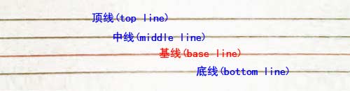
何为行高?顾名思意指一行文字的高度。具体来说是指两行文字间基线之间的距离。基线实在英文字母中用到的一个概念,我们刚学英语的时使用的那个英语本子每行有四条线,其中底部第二条线就是基线,是 a,c,z,x 等字母的底边线。下图的红色线即为基线。
代码:
line-height行高问题
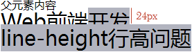 
下图是当line-height:1.5em的效果,父元素的行高为150%时,会根据父元素的字体大小先计算出行高值然后再让子元素继承。所以当line-height:1.5em时,子元素的行高等于16px * 1.5em = 24px:

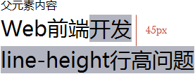
下图是当line-height:1.5的效果,父元素行高为1.5时,会根据子元素的字体大小动态计算出行高值让子元素继承。所以,当line-height:1.5时,子元素行高等于30px * 1.5 = 45px:

下图是当line-height:1.5em的效果,父元素的行高为150%时,会根据父元素的字体大小先计算出行高值然后再让子元素继承。所以当line-height:1.5em时,子元素的行高等于16px * 1.5em = 24px:

下图是当line-height:1.5的效果,父元素行高为1.5时,会根据子元素的字体大小动态计算出行高值让子元素继承。所以,当line-height:1.5时,子元素行高等于30px * 1.5 = 45px:

offsetHeight & clientHeight & scrollHeight
- clientHeight:返回以 Pixels 为单位的元素的内部高度,包括内边距但是不包括滚动轴的高度、边以及外边距。
- offsetHeight:包括元素的边宽、内边距以及水平滚动轴的高度。
- scrollHeight:返回整个元素内容的高度,包括没有被容纳在当前屏幕中的部分。
譬如下面这个 HTML 布局中:
<element
  ><!-- *content*: child nodes: -->
  | content A child node as text node | of
  <div id="another_child_node"></div>
  | the ... and I am the 4th child node | element
</element>
scrollHeight 包括 Entire Content 与 Padding,而 clientHeight 包括 Visible Content 以及 padding,offsetHeight 包括 Visible Content、padding、border 以及 scrollbar,形象地描述可见下图:
具体的例子可以参考JSFiddle,这里形象地对 offset*、client*以及 scroll*进行了比较
min-_ & max-_
overflow
margin & padding
Percentage Value:百分比值效果,无论垂直还是水平,百分比值始终参考宽度
当margin设置成百分数的时候,其top right bottom left的值是参照父元素盒子的宽度进行计算,在 w3c 的规范中也是这样描述的: margin 的百分比值参照其包含块的宽度进行计算,同样的 padding 如果设置成百分数的话,其盒子模型和 margin 是一样的。这只发生在默认的 writing-mode: horizontal-tb; 和 direction: ltr; 的情况下,当书写模式变成纵向的时候,其参照将会变成包含块的高度。我们可以以如下的例子进行说明:
<div class="demo1">
    <div>这个div设置:margin:10% 5%</div>
</div>

.demo1 {
  height: 500px;
  width: 980px;
  margin: 0 auto;
  background: red;
  overflow: hidden;
}

.demo1 div {
  margin: 10% 5%;
  background: white;
}
据以往的理解,.demo1 div的margin应该是:50px 49px 50px 49px,但是运行以后,通过查看盒模型示意图,却发现是:98px 49px 98px 49px。

为什么要选择宽度做参照而不是高度呢?这其实更多的要从 CSS 设计意图上去想,因为 CSS 的基础需求是排版,而通常我们所见的横排文字,其水平宽度一定(仔细回想一下,如果没有显式的定义宽度 或者强制一行显示,都会遇到边界换行,而不是水平延展),垂直方向可以无限延展。但当书写模式为纵向时,其参照就变成了高度而不再是宽度了。官方文档说明如下:
The percentage is calculated with respect to the width of the generated box’s containing block. Note that this is true for ‘margin-top’ and ‘margin-bottom’ as well. If the containing block’s width depends on this element, then the resulting layout is undefined in CSS 2.1.
display:box
Box 是传统的通用的容器属性,我们首先来介绍下 Box 的基本用法。因为在下文讲解 Flex 时候会提及,鉴于部分浏览器并不能支持 Flex 的全部特性,所以很多时候我们需要利用一些工具或者手写的方式将新版的 Flex 的语法转化为旧版的 Box 的语法。如果需要定义一个容器为 Box 的话,只需要做如下声明:
.box {
  display: -moz-box; /*Firefox*/
  display: -webkit-box; /*Safari,Opera,Chrome*/
  display: box;
}
容器属性
box-pack:子元素主轴对齐
box-pack 定义子元素主轴对齐方式。
.box{
-moz-box-pack: center; /*Firefox*/
-webkit-box-pack: center; /*Safari,Opera,Chrome*/
box-pack: center;
}
box-pack 属性总共有 4 个值:
.box{
box-pack: start | end | center | justify;
/*主轴对齐:左对齐(默认) | 右对齐 | 居中对齐 | 左右对齐*/
}
box-align:子元素交叉轴对齐
box-align 定义子元素交叉轴对齐方式。
.box{
-moz-box-align: center; /*Firefox*/
-webkit-box-align: center; /*Safari,Opera,Chrome*/
box-align: center;
}
box-align 属性总共有 5 个值:
.box{
box-align: start | end | center | baseline | stretch;
/*交叉轴对齐:顶部对齐(默认) | 底部对齐 | 居中对齐 | 文本基线对齐 | 上下对齐并铺满*/
}
box-direction:子元素显示方向
box-direction 定义子元素的显示方向。
.box{
-moz-box-direction: reverse; /*Firefox*/
-webkit-box-direction: reverse; /*Safari,Opera,Chrome*/
box-direction: reverse;
}
box-direction 属性总共有 3 个值:
.box{
box-direction: normal | reverse | inherit;
/*显示方向:默认方向 | 反方向 | 继承子元素的 box-direction*/
}
box-orient:子元素行内排列方式
.box{
-moz-box-orient: horizontal; /*Firefox*/
-webkit-box-orient: horizontal; /*Safari,Opera,Chrome*/
box-orient: horizontal;
}
box-orient 属性总共有 5 个值:
.box{
box-orient: horizontal | vertical | inline-axis | block-axis | inherit;
/*排列方向:水平 | 垂直 | 行内方式排列(默认) | 块方式排列 | 继承父级的box-orient*/
}
box-lines:子元素换行
.box{
-moz-box-lines: multiple; /*Firefox*/
-webkit-box-lines: multiple; /*Safari,Opera,Chrome*/
box-lines: multiple;
}
box-lines 属性总共有 2 个值:
.box{
box-lines: single | multiple;
/*允许换行:不允许(默认) | 允许*/
}
子元素属性
box-flex:是否允许缩放
box-flex 定义是否允许当前子元素伸缩。
.item{
-moz-box-flex: 1.0; /*Firefox*/
-webkit-box-flex: 1.0; /*Safari,Opera,Chrome*/
box-flex: 1.0;
}
box-flex 属性使用一个浮点值:
.item{
box-flex: <value>;
/*伸缩:<一个浮点数,默认为0.0,即表示不可伸缩,大于0的值可伸缩,柔性相对>*/
}
box-ordinal-group:子元素显示次序
box-ordinal-group 定义子元素的显示次序,数值越小越排前。
.item{
-moz-box-ordinal-group: 1; /*Firefox*/
-webkit-box-ordinal-group: 1; /*Safari,Opera,Chrome*/
box-ordinal-group: 1;
}
box-direction 属性使用一个整数值:
.item{
box-ordinal-group: <integer>;
/*显示次序:<一个整数,默认为1,数值越小越排前>*/
}