
ActionBar
Introduction
Toolbar是某个应用程序中 Action Bar 的泛华。Action Bar 指 Activity 中承载了导航按钮、Brand、标题和副标题这些部分。
Toolbar & ActionBar
ActionBar
ToolBar
在开发一个 Android 应用中另一个比较重要的组件就是 Toolbar,它的作用很类似于早年的 Android 中的 Action Bar,它主要担负着如下几个功能:
- 导航按钮
- 应用标题与副标题
- 活动菜单
- 图标

如果需要在应用中引入 Toolbar 的支持,首先需要设置下 style 主题,来去除原本的默认的 ActionBar。
<style name="AppBaseTheme" parent="Theme.AppCompat.Light.NoActionBar"><!--Light.DarkActionBar表示默认的黑色主体的Actionbar-->
  <!-- Customize your theme here. -->
  <item name="colorPrimary">@color/sky_blue</item>
  <item name="colorPrimaryDark">@color/deep_blue</item>
  <item name="colorAccent">@color/material_deep_teal_200</item>
  <item name="android:textColorPrimary">@color/white</item>
</style>
colorPrimary 表示标题栏 ActionBar 的颜色;colorPrimaryDark 表示状态栏的颜色;colorAccent 表示输入框,按钮等被选中时的颜色;textColorPrimary 表示标题栏(ActionBar 或者 ToolBar)中字体的颜色。接下来,在你需要引入 ToolBar 的布局文件中引入 ToolBar:
<android.support.v7.widget.Toolbar
        android:id="@+id/main_toolbar"
        android:theme="@style/ThemeOverlay.AppCompat.Dark"//这里的主题可以用来反衬toolBar的overFlow颜色
        android:layout_width="match_parent"
        android:layout_height="wrap_content"
        android:background="@color/sky_blue"
        >
</android.support.v7.widget.Toolbar>
然后,在代码中获取 ToolBar 控件以及实例化:
Toolbar toolbar = (Toolbar) findViewById(R.id.main_toolbar);
       toolbar.setNavigationIcon(R.mipmap.ic_toc_white_24dp);//设置ToolBar头部图标
       toolbar.setTitle("ToolBar");//设置标题,也可以在xml中静态实现
       setSupportActionBar(toolbar);//使活动支持ToolBar
Action Menu( 活动菜单 )
Search View( 搜索菜单 )
如果需要在 Toolbar 中引入 SearchView,首先需要在菜单配置中加入 SearchView 的控件:
//menu.xml
<menu xmlns:android="http://schemas.android.com/apk/res/android"
    xmlns:shivamgps="http://schemas.android.com/apk/res-auto"
    xmlns:tools="http://schemas.android.com/tools" tools:context=".HomeActivity">

    <item
        android:id="@+id/action_search"
        android:icon="@drawable/ic_search"
        shivamgps:showAsAction="always"
        shivamgps:actionViewClass="android.support.v7.widget.SearchView"
        android:title="Search"/>

    <item
        android:id="@+id/action_refresh"
        android:icon="@drawable/ic_refresh"
        shivamgps:showAsAction="always"
        android:title="@string/refresh"/>

</menu>
然后在构造选项菜单时候:
@Override
 public void onCreateOptionsMenu(Menu menu, MenuInflater inflater) {
        inflater.inflate(R.menu.home, menu);
        MenuItem searchItem = menu.findItem(R.id.action_search);
        SearchManager searchManager = (SearchManager) getActivity().getSystemService(Context.SEARCH_SERVICE);
        SearchView searchView = null;
        if (searchItem != null) {
            searchView = (SearchView) searchItem.getActionView();
        }
        if (searchView != null) {
            searchView.setSearchableInfo(searchManager.getSearchableInfo(getActivity().getComponentName()));

            SearchView.OnQueryTextListener queryTextListener = new SearchView.OnQueryTextListener()
            {
                @Override
                public boolean onQueryTextChange(String newText)
                {


                    Log.i("onQueryTextChange", newText);

                    return true;
                }
                @Override
                public boolean onQueryTextSubmit(String query)
                {
                    Log.i("onQueryTextSubmit", query);

                    return true;
                }
            };

            searchView.setOnQueryTextListener(queryTextListener);
        }
        super.onCreateOptionsMenu(menu, inflater);
    }

    @Override
    public boolean onOptionsItemSelected(MenuItem item) {
        switch (item.getItemId()) {
            case R.id.action_search:
                // Not implemented here
                return false;
            case R.id.action_refresh:
                getVehicleOverViewList();
                return true;
            default:
                break;
        }

        return false;
    }
            searchView.setOnQueryTextListener(queryTextListener);
        }
        super.onCreateOptionsMenu(menu, inflater);
    }
floatingsearchview

CollapsingToolbarLayout
提供了对于 Toolbar 的又一层包裹,可以用作视差滚动等效果。
当向下滚动时 ,Banner 大图会跟随滚动手势而 Collapse. 最后收折成一个普通的 ActionBar( 实际是个 Toolbar,Android 官方在最新的 Support Library 都推荐把 ActionBar 替换成 Toolbar).
通过属性 Flag 的组合, 也能实现把 ActionBar 直接推出屏幕, 让其消失 .
Android Support Library 中提供的 CollapseToolbar 实现这效果 .
<?xml version="1.0" encoding="utf-8"?>
<android.support.design.widget.CoordinatorLayout
  xmlns:android="http://schemas.android.com/apk/res/android"
  xmlns:app="http://schemas.android.com/apk/res-auto"
  android:layout_width="match_parent"
  android:layout_height="match_parent"
  android:fitsSystemWindows="true">
  <android.support.design.widget.AppBarLayout
    android:layout_width="match_parent"
    android:layout_height="wrap_content"
    android:fitsSystemWindows="true">
    <android.support.design.widget.CollapsingToolbarLayout
      android:id="@+id/collapsing_toolbar"
      android:layout_width="match_parent"
      android:layout_height="match_parent"
      android:fitsSystemWindows="true"
      app:contentScrim="?attr/colorPrimary"
      app:expandedTitleMarginEnd="64dp"
      app:expandedTitleMarginStart="48dp"
      app:layout_scrollFlags="scroll|exitUntilCollapsed">
      <ImageView
        android:id="@+id/backdrop"
        android:layout_width="match_parent"
        android:layout_height="match_parent"
        android:fitsSystemWindows="true"
        app:layout_collapseMode="parallax"
        android:scaleType="centerCrop"
        android:src="@drawable/mu"
        android:transitionName="mu"/>
      <android.support.v7.widget.Toolbar
        android:id="@+id/toolbar"
        android:layout_width="match_parent"
        android:layout_height="?attr/actionBarSize"
        app:layout_collapseMode="pin"
        app:popupTheme="@style/ThemeOverlay.AppCompat.Light"
        app:theme="@style/MyToolbarTheme"/>
    </android.support.design.widget.CollapsingToolbarLayout>
  </android.support.design.widget.AppBarLayout>
  <android.support.v7.widget.RecyclerView
    android:id="@+id/recycler_view"
    android:layout_width="match_parent"
    android:layout_height="match_parent"
    app:layout_behavior="@string/appbar_scrolling_view_behavior"/>
</android.support.design.widget.CoordinatorLayout>
这是 Layout 布局 .CoordinatorLayout 和 AppBarLayout 的组合在 这篇随笔 中有介绍, 实现了滚动隐藏 Toolbar 的效果, 这里就不在重复了 .
CollapsingToolbarLayout 是实现 GIF 效果的关键 .
CollapsingToolbarLayout 有两个 Children.ImageView 用来显示 Banner 大图, 即 Gif 中曼联队徽的大图 . 而 Toolbar 就是折叠后看到的顶栏 Toolbar.
app:contentScrim="?attr/colorPrimary" ,CollapsingToolbarLayout 这个属性是设置折叠后 Toolbar 的颜色 .
app:layout_scrollFlags=“scroll|exitUntilCollapsed”, 这是两个 Flag 控制滚动时候 CollapsingToolbarLayout 的表现 .
-
**Scroll, ** 表示向下滚动列表时候 ,CollapsingToolbarLayout 会滚出屏幕并且消失 ( 原文解释 :this flag should be set for all views that want to scroll off the screen - for views that do not use this flag, they’ll remain pinned to the top of the screen)
-
**exitUntilCollapsed, ** 表示这个 layout 会一直滚动离开屏幕范围, 直到它收折成它的最小高度 .( 原文解释 :this flag causes the view to scroll off until it is ‘collapsed’ (its minHeight) before exiting)
app:layout_collapseMode=“parallax”, 这是控制滚出屏幕范围的效果的
-
parallax, 表示滚动过程中, 会一直保持可见区域在正中间 .
-
pin, 表示不会被滚出屏幕范围 .
  @Override
protected void onCreate(Bundle savedInstanceState) {
  super.onCreate(savedInstanceState);
  setContentView(R.layout.fourth_activity);
  final Toolbar toolbar = (Toolbar) findViewById(R.id.toolbar);
  setSupportActionBar(toolbar);
  ActionBar actionBar = getSupportActionBar();
  if (actionBar != null) {
    actionBar.setDisplayHomeAsUpEnabled(true);
  }
  final CollapsingToolbarLayout collapsingToolbar = (CollapsingToolbarLayout) findViewById(
      R.id.collapsing_toolbar);
  collapsingToolbar.setTitle(getString(R.string.fourth_activity));
  final RecyclerView recyclerView = (RecyclerView) findViewById(R.id.recycler_view);
  LinearLayoutManager linearLayoutManager = new LinearLayoutManager(this);
  linearLayoutManager.setOrientation(LinearLayoutManager.VERTICAL);
  recyclerView.setLayoutManager(linearLayoutManager);
  recyclerView.setAdapter(new MyAdapter(this));
  Bitmap bitmap = BitmapFactory.decodeResource(getResources(), R.drawable.mu);
  Palette.from(bitmap).generate(new Palette.PaletteAsyncListener() {
    @Override
    public void onGenerated(final Palette palette) {
      int defaultColor = getResources().getColor(R.color.medium_blue);
      int defaultTitleColor = getResources().getColor(R.color.white);
      int bgColor = palette.getDarkVibrantColor(defaultColor);
      int titleColor = palette.getLightVibrantColor(defaultTitleColor);
      collapsingToolbar.setContentScrimColor(bgColor);
      collapsingToolbar.setCollapsedTitleTextColor(titleColor);
      collapsingToolbar.setExpandedTitleColor(titleColor);
    }
  });
}
这是 Activity 的 onCreate 方法, 有两处地方需要关注的
\1. setSupportActionBar() 方法, 告诉 AppCompatActivity 哪一个是 ActionBar( 实际是 Toolbar). 不然的话, 做透明 Status Bar( 电池, 手机信号那一区域 ) 效果时候 ,ActionBar 会位置不正确 .
\2. Palette, 调色板的意思, 也是 Android Support Library 提供的 . 用来抓取 Bitmap 的颜色 . 在此处的用处是, 当 ActionBar 被收折后, 背景颜色能保持和 Banner 大图的色调一致, 而 Title 文字的颜色保证和 Banner 大图的色调形成强对比 .
AppBar Layout
AppBarLayout 是继承 LinerLayout 实现的一个 ViewGroup 容器组件,它是为了 Material Design 设计的 App Bar,支持手势滑动操作。

默认的 AppBarLayout 是垂直方向的,它的作用是把 AppBarLayout 包裹的内容都作为 AppBar。类似上面图片贴出来的效果,代码布局如下:
<android.support.design.widget.AppBarLayout
        android:id="@+id/appbar"
        android:layout_width="match_parent"
        android:layout_height="wrap_content">

        <android.support.v7.widget.Toolbar
            android:id="@+id/toolbar"
            android:layout_width="match_parent"
            android:layout_height="?attr/actionBarSize"
            android:background="?attr/colorPrimary"
            android:minHeight="?attr/actionBarSize"></android.support.v7.widget.Toolbar>

        <android.support.design.widget.TabLayout
            android:id="@+id/tabs"
            android:layout_width="match_parent"
            android:layout_height="wrap_content"
            app:layout_scrollFlags="scroll"
            app:tabIndicatorColor="@android:color/holo_red_dark"
            app:tabSelectedTextColor="@android:color/holo_red_dark"
            app:tabTextColor="@android:color/black" />

    </android.support.design.widget.AppBarLayout>
此处将 Toolbar 和 Tablayout 的组合部分共同构成 AppBar 的效果。注意: AppBarLayout 必须作为 Toolbar 的父布局容器,AppBarLayout 是支持手势滑动效果的。
Parallax Header
AppBarLayout 往往跟 CoordinatorLayout 合作,可以实现视差滚动的效果。

从开发文档中可以了解到,CoordinatorLayout 是一个增强型的 FrameLayout。它的作用有两个
例如一下布局代码:
 <?xml version="1.0" encoding="utf-8"?>
<android.support.design.widget.CoordinatorLayout xmlns:android="http://schemas.android.com/apk/res/android"
    xmlns:app="http://schemas.android.com/apk/res-auto"
    android:id="@+id/main_content"
    android:layout_width="match_parent"
    android:layout_height="match_parent">


    <android.support.design.widget.AppBarLayout
        android:id="@+id/appbar"
        android:layout_width="match_parent"
        android:layout_height="wrap_content">

        <android.support.v7.widget.Toolbar
            android:id="@+id/toolbar"
            android:layout_width="match_parent"
            android:layout_height="?attr/actionBarSize"
            android:background="?attr/colorPrimary"
            app:layout_scrollFlags="scroll|enterAlways" />

        <android.support.design.widget.TabLayout
        android:id="@+id/tabs"
        android:layout_width="match_parent"
        android:layout_height="wrap_content"
        app:tabGravity="fill" />


    </android.support.design.widget.AppBarLayout>

    <!--可滑动的布局内容-->
    <android.support.v7.widget.RecyclerView
        android:id="@+id/recyclerView"
        android:layout_width="match_parent"
        android:layout_height="wrap_content"
        app:layout_behavior="@string/appbar_scrolling_view_behavior" />

    <android.support.design.widget.FloatingActionButton
        android:layout_width="wrap_content"
        android:layout_height="wrap_content"
        android:src="@drawable/ic_discuss"
        android:layout_gravity="bottom|end"/>


</android.support.design.widget.CoordinatorLayout>
从上面布局看到,CoordinatorLayout 协调布局中包裹了两个布局,一个是 NestedScrollView,一个是 AppBarLayout,以及 FAB 按钮。
我们来看看 CoordinatorLayout 是怎么来协调这两个子视图手势操作的。
- 由于 CoordinatorLayout 是 FrameLayout 布局,我们可以通过
android:layout_gravity="bottom|end"
属性来控制组件在整个布局中的位置,比如上面效果中的 FAB 就是通过 android:layout_gravity=”bottom|end” 来确定 FAB 的位置在底端的最右边的位置。
- 为了达到上面效果图的手势动画效果,我们必须做如下设置,通过 app:layout_scrollFlags=”scroll|enterAlways” 属性来确定哪个组件是可滑动的
设置的 layout_scrollFlags 有如下几种选项:
- scroll: 所有想滚动出屏幕的 view 都需要设置这个 flag- 没有设置这个 flag 的 view 将被固定在屏幕顶部。
- enterAlways: 这个 flag 让任意向下的滚动都会导致该 view 变为可见,启用快速 “ 返回模式 ”。
- enterAlwaysCollapsed: 当你的视图已经设置 minHeight 属性又使用此标志时,你的视图只能已最小高度进入,只有当滚动视图到达顶部时才扩大到完整高度。
- exitUntilCollapsed: 滚动退出屏幕,最后折叠在顶端。
我们上面的布局中 给 Toolbar 设置了 app:layout_scrollFlags 属性,因此,Toolbar 是可以滚动出屏幕,且向下滚动有可以出现。
- 为了使得 Toolbar 可以滑动,我们必须还得有个条件,就是 CoordinatorLayout 布局下包裹一个可以滑动的布局,比如 RecyclerView,NestedScrollView( 经过测试,ListView,ScrollView 不支持 ) 具有滑动效果的组件。并且给这些组件设置如下属性来告诉 CoordinatorLayout,该组件是带有滑动行为的组件,然后 CoordinatorLayout 在接受到滑动时会通知 AppBarLayout 中可滑动的 Toolbar 可以滑出屏幕了。
app:layout_behavior="@string/appbar_scrolling_view_behavior"
总结: 为了使得 Toolbar 有滑动效果,必须做到如下三点:
app:layout_behavior="@string/appbar_scrolling_view_behavior"
##CollapsingToolbarLayout

CollapsingToolbarLayout 包裹 Toolbar 的时候提供一个可折叠的 Toolbar,一般作为 AppbarLayout 的子视图使用。
CollapsingToolbarLayout 提供以下属性和方法是用:
- Collapsing title : ToolBar 的标题,当 CollapsingToolbarLayout 全屏没有折叠时,title 显示的是大字体,在折叠的过程中,title 不断变小到一定大小的效果。你可以调用 setTitle(CharSequence) 方法设置 title。
- Content scrim : ToolBar 被折叠到顶部固定时候的背景,你可以调用 setContentScrim(Drawable) 方法改变背景或者 在属性中使用 app:contentScrim="?attr/colorPrimary" 来改变背景。
- Status bar scrim:状态栏的背景,调用方法 setStatusBarScrim(Drawable)。还没研究明白,不过这个只能在 Android5.0 以上系统有效果。
- Parallax scrolling children : CollapsingToolbarLayout 滑动时,子视图的视觉差,可以通过属性 app:layout_collapseParallaxMultiplier=“0.6” 改变。
- CollapseMode:子视图的折叠模式,有两种 “pin”:固定模式,在折叠的时候最后固定在顶端;“parallax”:视差模式,在折叠的时候会有个视差折叠的效果。我们可以在布局中使用属性 app:layout_collapseMode=“parallax” 来改变。
布局代码如下:
总结: CollapsingToolbarLayout 主要是提供一个可折叠的 Toolbar 容器,对容器中的不同视图设置 layout_collapseMode 折叠模式,来达到不同的折叠效果。
1.Toolbar 的高度 layout_height 必须固定,不能 “wrap_content”,否则 Toolbar 不会滑动,也没有折叠效果。2. 为了能让 FloatingActionButton 也能折叠且消失出现,我们必须给 FAB 设置锚点属性 app:layout_anchor="@id/appbar"
意思是FAB浮动按钮显示在哪个布局区域。
且设置当前锚点的位置
app:layout_anchorGravity=”bottom|end|right”
意思FAB浮动按钮在这个布局区域的具体位置。
两个属性共同作用才是的FAB 浮动按钮也能折叠消失,出现。
3.给需要有折叠效果的组件设置 layout_collapseMode属性。
### OverscrollScaling(滚动缩放)
效果如下所示:

参考博客地址,[这里](https://medium.com/@nullthemall/overscroll-appbarlayout-behavior-e58f1ee2807#.nua34q5uh),[代码地址](https://gist.github.com/NikolaDespotoski/7d6a019e5aafe60ebade)
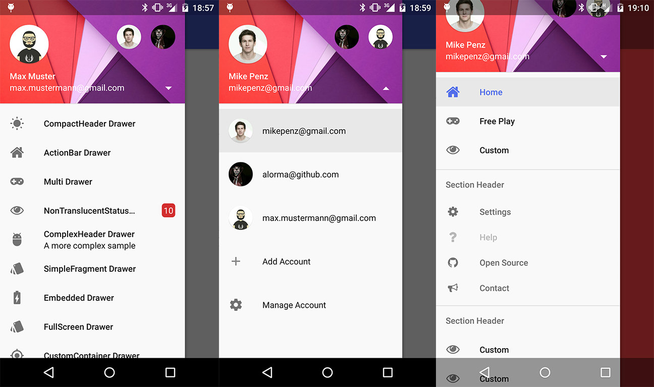
# Navigation Drawer
在Android提出Material Design设计方案之后,对于菜单栏,Android也是提供了一种所谓的[Navigation Drawer][1]的侧边菜单栏设计方案。Navigation Drawer与Toolbar相比更多的是一种全局的设计配置方式,往往会在Activity的最外层包裹一个DrawerLayout,具体的主页面的几个Tab可以用Fragment的方式插入到Activity种。
DrawerLayout提供了整个抽屉的容器,而NavigationView是后期推出的专门针对Draw中头部与菜单的继承自ListView的布局。

用于侧滑菜单中的menu布局。之前Google在V4包中推出自己的 DrawerLayout作为抽屉侧滑菜单,标准使用方法可以参考 google 原生态 抽屉式侧滑菜单 Android DrawerLayout 布局的使用介绍。
当时的官方布局是这样的:
<android.support.v4.widget.DrawerLayout xmlns:android=“http://schemas.android.com/apk/res/android"\ android:id=”@+id/drawer_layout"
android:layout_width=“match_parent”
android:layout_height=“match_parent” >
<!-- the main content view -->

<FrameLayout
    android:id="@+id/frame_content"
    android:layout_width="match_parent"
    android:layout_height="match_parent" >
</FrameLayout>

<!-- the navigetion view -->

<ListView
    android:id="@+id/drawer_list"
    android:layout_width="240dp"
    android:layout_height="match_parent"
    android:layout_gravity="start"
    android:background="#9999cc"
    android:choiceMode="singleChoice"
    android:divider="@android:color/transparent"
    android:dividerHeight="0dp" >
</ListView>
</android.support.v4.widget.DrawerLayout>
其实这次谷歌只是将上面的ListView布局替换成NavigationView了。简化了之前ListView写适配器的繁琐。

先如今布局改成如下:
<android.support.v4.widget.DrawerLayout xmlns:android=“http://schemas.android.com/apk/res/android" xmlns:app=“http://schemas.android.com/apk/res-auto" android:id=”@+id/drawer_layout” android:layout_width=“match_parent” android:layout_height=“match_parent”>
<!-- the main content view -->

<include layout="@layout/layout_content" />

<!-- the navigetion view -->

<android.support.design.widget.NavigationView
    android:id="@+id/navigationView"
    android:layout_width="wrap_content"
    android:layout_height="match_parent"
    android:layout_gravity="left"
    android:fitsSystemWindows="true"
    app:headerLayout="@layout/layout_header"
    app:menu="@layout/layout_menu">

</android.support.design.widget.NavigationView>
</android.support.v4.widget.DrawerLayout>
中NavigationView 中的 android:layout_gravity=”start” 属性来控制抽屉菜单从哪边滑出,一般“start ”从左边滑出,“end”从右边滑出。

这里最主要的两个属性分别是:

1.app:headerLayout: 给NavigationView添加头部布局

2.app:menu:给NavigationView添加menu菜单布局

app:headerLayout布局如下:
<ImageView
    android:layout_width="125dp"
    android:layout_height="125dp"
    android:scaleType="centerCrop"
    android:src="@drawable/image" />

<TextView
    android:layout_marginTop="15dp"
    android:layout_width="wrap_content"
    android:layout_height="wrap_content"
    android:text="CSDN废墟的树博客"
    android:textColor="@android:color/white" />
app:menu 布局如下:
<?xml version="1.0" encoding="utf-8"?>
<menu xmlns:android="http://schemas.android.com/apk/res/android"
    android:layout_width="match_parent"
    android:layout_height="match_parent">

    <group
        android:checkableBehavior="single"
        android:title="Home items">

        <item
            android:id="@+id/nav_blog"
            android:icon="@drawable/ic_account_balance_black_24dp"
            android:title="博客地址" />

        <item
            android:id="@+id/nav_ver"
            android:icon="@drawable/ic_error_outline_black_36dp"
            android:title="版本信息" />

        <item
            android:id="@+id/nav_about"
            android:icon="@drawable/ic_error_outline_black_36dp"
            android:title="关于我" />

    </group>

    <item android:title="Sub items">

        <menu>

            <item
                android:id="@+id/sub_exit"
                android:icon="@drawable/ic_power_settings_new_black_36dp"
                android:title="退出应用" />

            <item
                android:id="@+id/sub_switch"
                android:icon="@drawable/ic_settings_applications_black_36dp"
                android:title="切换主题" />
        </menu>
    </item>

</menu>
代码中控制 NavigationView
private void initNavigationView(){
        navigationView = (NavigationView) findViewById(R.id.navigationView);
        drawerLayout = (DrawerLayout) findViewById(R.id.drawer_layout);
        //设置侧滑菜单选择监听事件
        navigationView.setNavigationItemSelectedListener(new NavigationView.OnNavigationItemSelectedListener() {
            @Override
            public boolean onNavigationItemSelected(MenuItem menuItem) {
                menuItem.setChecked(true);
                //关闭抽屉侧滑菜单
                drawerLayout.closeDrawers();
                return true;
            }
        });
    }

    @Override
    public boolean onOptionsItemSelected(MenuItem item) {
        if (item.getItemId() == android.R.id.home){
            //打开抽屉侧滑菜单
            drawerLayout.openDrawer(GravityCompat.START);
        }
        return super.onOptionsItemSelected(item);
    }
关于 NavigationView 中 item 的字体颜色和 icon 选中状态颜色是去当前主题 theme 中的
<--正常状态下字体颜色和icon颜色-->
<item name="android:textColorPrimary">@android:color/darker_gray</item>
<--选中状态icon的颜色和字体颜色-->
 <item name="colorPrimary">@color/accent_material_light</item>
Github-Material Drawer
Material Drawer是对于Android原生的Navigation Drawer的一种封装,它可以让开发人员快速地在应用中集成Drawer。可以在Gradle中添加如下参数来添加该插件:
compile('com.mikepenz:materialdrawer:3.0.9@aar') {
    transitive = true
}
-
简单引入
new DrawerBuilder().withActivity(this).build()
<?xml version="1.0" encoding="utf-8"?><!--
  ~ Copyright (C) 2015 The Android Open Source Project
  ~
  ~ Licensed under the Apache License, Version 2.0 (the "License");
  ~ you may not use this file except in compliance with the License.
  ~ You may obtain a copy of the License at
  ~
  ~      http://www.apache.org/licenses/LICENSE-2.0
  ~
  ~ Unless required by applicable law or agreed to in writing, software
  ~ distributed under the License is distributed on an "AS IS" BASIS,
  ~ WITHOUT WARRANTIES OR CONDITIONS OF ANY KIND, either express or implied.
  ~ See the License for the specific language governing permissions and
  ~ limitations under the License.
-->

<android.support.design.widget.CoordinatorLayout xmlns:android="http://schemas.android.com/apk/res/android"
    xmlns:app="http://schemas.android.com/apk/res-auto"
    android:id="@+id/main_content"
    android:layout_width="match_parent"
    android:layout_height="match_parent"
    android:fitsSystemWindows="true">

    <android.support.design.widget.AppBarLayout
        android:id="@+id/appbar"
        android:layout_width="match_parent"
        android:layout_height="200dp"
        android:fitsSystemWindows="true"
        android:theme="@style/ThemeOverlay.AppCompat.Dark.ActionBar">

        <android.support.design.widget.CollapsingToolbarLayout
            android:id="@+id/collapsing_toolbar"
            android:layout_width="match_parent"
            android:layout_height="match_parent"
            android:fitsSystemWindows="true"
            app:contentScrim="?attr/colorPrimary"
            app:expandedTitleMarginEnd="64dp"
            app:expandedTitleMarginStart="48dp"
            app:layout_scrollFlags="scroll|exitUntilCollapsed"
            app:titleEnabled="true">

            <ImageView
                android:id="@+id/backdrop"
                android:layout_width="match_parent"
                android:layout_height="match_parent"
                android:fitsSystemWindows="true"
                android:scaleType="centerCrop"
                app:layout_collapseMode="parallax" />

            <!-- As our statusBar is transparent below and content is moved behind our toolbar has to include the padding on top so we use this area -->
            <android.support.v7.widget.Toolbar
                android:id="@+id/toolbar"
                android:layout_width="match_parent"
                android:layout_height="?attr/actionBarSize"
                android:paddingTop="@dimen/tool_bar_top_padding"
                app:layout_collapseMode="pin"
                app:popupTheme="@style/ThemeOverlay.AppCompat.Light" />

        </android.support.design.widget.CollapsingToolbarLayout>

    </android.support.design.widget.AppBarLayout>

    <android.support.v4.widget.NestedScrollView
        android:layout_width="match_parent"
        android:layout_height="match_parent"
        app:layout_behavior="@string/appbar_scrolling_view_behavior">

        <LinearLayout
            android:layout_width="match_parent"
            android:layout_height="match_parent"
            android:orientation="vertical"
            android:paddingTop="24dp">

            <android.support.v7.widget.CardView
                android:layout_width="match_parent"
                android:layout_height="wrap_content"
                android:layout_margin="16dp">

                <LinearLayout
                    android:layout_width="match_parent"
                    android:layout_height="wrap_content"
                    android:orientation="vertical"
                    android:paddingBottom="24dp"
                    android:paddingLeft="16dp"
                    android:paddingRight="16dp"
                    android:paddingTop="24dp">

                    <TextView
                        android:layout_width="match_parent"
                        android:layout_height="wrap_content"
                        android:text="Info"
                        android:textAppearance="@style/TextAppearance.AppCompat.Title" />

                    <TextView
                        android:layout_width="match_parent"
                        android:layout_height="wrap_content"
                        android:text="@string/lorem_ipsum" />

                </LinearLayout>

            </android.support.v7.widget.CardView>

            <android.support.v7.widget.CardView
                android:layout_width="match_parent"
                android:layout_height="wrap_content"
                android:layout_marginBottom="16dp"
                android:layout_marginLeft="16dp"
                android:layout_marginRight="16dp">

                <LinearLayout
                    android:layout_width="match_parent"
                    android:layout_height="wrap_content"
                    android:orientation="vertical"
                    android:paddingBottom="24dp"
                    android:paddingLeft="16dp"
                    android:paddingRight="16dp"
                    android:paddingTop="24dp">

                    <TextView
                        android:layout_width="match_parent"
                        android:layout_height="wrap_content"
                        android:text="Friends"
                        android:textAppearance="@style/TextAppearance.AppCompat.Title" />

                    <TextView
                        android:layout_width="match_parent"
                        android:layout_height="wrap_content"
                        android:text="@string/lorem_ipsum" />

                </LinearLayout>

            </android.support.v7.widget.CardView>

            <android.support.v7.widget.CardView
                android:layout_width="match_parent"
                android:layout_height="wrap_content"
                android:layout_marginBottom="16dp"
                android:layout_marginLeft="16dp"
                android:layout_marginRight="16dp">

                <LinearLayout
                    android:layout_width="match_parent"
                    android:layout_height="wrap_content"
                    android:orientation="vertical"
                    android:paddingBottom="24dp"
                    android:paddingLeft="16dp"
                    android:paddingRight="16dp"
                    android:paddingTop="24dp">

                    <TextView
                        android:layout_width="match_parent"
                        android:layout_height="wrap_content"
                        android:text="Related"
                        android:textAppearance="@style/TextAppearance.AppCompat.Title" />

                    <TextView
                        android:layout_width="match_parent"
                        android:layout_height="wrap_content"
                        android:text="@string/lorem_ipsum" />

                </LinearLayout>

            </android.support.v7.widget.CardView>

        </LinearLayout>

    </android.support.v4.widget.NestedScrollView>

    <android.support.design.widget.FloatingActionButton
        android:id="@+id/floating_action_button"
        android:layout_width="wrap_content"
        android:layout_height="wrap_content"
        android:layout_margin="16dp"
        android:clickable="true"
        app:layout_anchor="@id/appbar"
        app:layout_anchorGravity="bottom|right|end" />

</android.support.design.widget.CoordinatorLayout>
ActionBar
Styles
Translucent Bar( 透明状态栏 ) & Immersive Mode( 沉浸式状态栏 )
透明状态栏与沉浸式状态栏不是同一种东西,透明状态栏源自 ActionBar,只是其颜色和设计状态发生了变化,一般呈现的是状态栏和 / 或导航栏透明或半透明 . 最极端的例子是在 Muzei 这样的应用上
关于透明栏的更多描述参见 : System Bars (Material Design)。沉浸式对应的是 Immersive Mode, 呈现的形式是全屏状态, 隐藏状态栏与导航栏。
Search View
MaterialSearchView
MaterialSearchView 的作用即是为 Android 的 ToolBar
Utils
StatusBarUtil

Popup Menu( 弹出式菜单 )
PinterestView

BoomMenu

